This project was definitely one for the books. We were asked to create a 23 second ad for ÅžÖlen – a Turkish candy and chocolate company. We were given three weeks to produce a set of three videos (each for different product line) and the general guidelines regarding the current style used by the client’s ads this season.
With the storyboards approved, we contacted Onur Senturk, whom you might know from his independent pieces such as Nokta or TRIâ–²NGLE. Onur took care of animating the ribbons, while I did the colors, particles, light fx and all that extra shiny-sparkly stuff. Leo Burnett – agency for this project – provided us with the 3D renders of the products and the audio track.
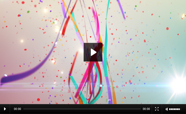
The compositing of this project was quite a nightmare, but eventually I pulled through. Around 4 days before the air time we had the animation completed, with just some minor tweaks to the pack shot left to be done. Here’s the result:
The project passed the agency critique and went for the client approval. And then came the bomb. Apparently, due to a miscommunication on the higher levels, the client was not aware of the direction the project was heading and decided to axe it. Three weeks of work went down the drain and with four days left till air time, the clock was still ticking.
Without any time to recover from several all-nighters pulled in the final crunch of the original cut, I had to dive back into the project and do it from scratch. Since there was no more time left for new 3D, we dug up some footage shot for last year’s commercial, composited it within the hi-res version of the packshot scene, added some lights, products, cameras and particles and managed to save the project’s broadcast date.
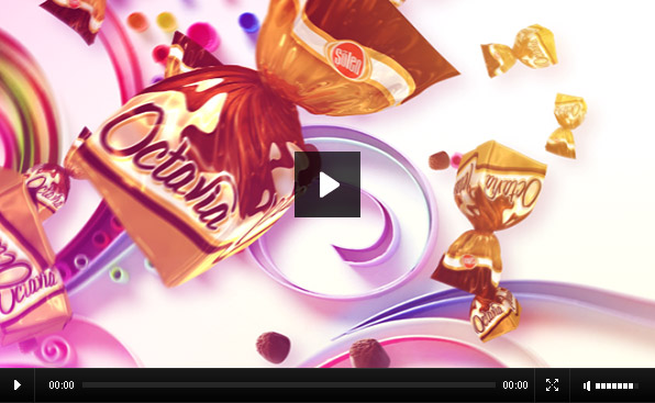
The final cut can be seen below. (I am not sure if redoing pretty much everything qualifies as “cut”.)
Now, I am not going to go into which version I like more (although it’s probably easy to guess), but I am really curious about your opinion. Let me know what you think about it in the comments!
Client: ÅžÖlen
Agency: Leo Burnett
Directed by: Quba Michalski
Design, Animation & Compositing: Quba Michalski
3D Ribbons (Original Cut): Onur Senturk
Paper Sculpture by: Yulia Brodskaya
Tools: Photoshop, Illustrator, After Effects, Cinema 4D, 3D Studio Max
6 Comments
Add comment
This site uses Akismet to reduce spam. Learn how your comment data is processed.


I like your first version much more.
First Version is the best.
I miss time remapping and start spreading out when the sound pumps in.
But anyways well done.
Ahh … which parts are 3D Data ?
Warti:
I am not sure if I understand your question about 3D data…
I had the ribbons rendered in Max by Onur with multiple passes (beauty, reflections, motion vectors, depth and alpha). The candies were rendered doing 360 degrees rotation in C4D and then used as sprites, either positioned manually or in a particle system. The background is a mix of original backdrop from Max and 2D/3D solids in After Effects.
Confetti, lighting and putting it all together was done in AE as well.
exactly what i want to know ;) I was not sure about the ribbons.
I love the first video more. It shows the product well it is short and snappy. The second one is very good too but I think the problem was that the close up was too close. If the distance was kept a bit further it would have been a winner. I love your work it is very original
[…] This time I collaborated with Leo Burnet Turkey to work on the project for Solen, which is one of the biggest confectionary company producing sweets & chocolates in Turkey. The campaign focused on Ramadan “Gift box chocolates” communication and included TV, press ads and outdoor. I have created the paper illustration, which has been adapted and used for the billboards and animation. Here you can see the final TV ad, as well as read about the uneasy working process of the team involved in production and also check the initial video they created, which I personally really like: Video […]