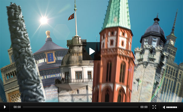
This is a teaser TVC created for the launch of Turkish Airlines’ new international campaign Globally Yours.
The ad was initially planned as a photorealistic 3D animation, but due to the budget and time restrains, was transferred into a 2.5D platform. Still, it was by far one of the most complex projects we have worked on – not due to the animation and effects – but to the sheer amount of layers used in the compositions. The final animation is build out of nearly a thousand 2D layers animated in a 3D space.
You may recognize this project from earlier posts on QubaHQ – it took a while to get it on air but it is finally here. I used a total of 933 layers to create the globe, featuring 93 landmarks and 35 cloud sprites, duplicated and distributed around a central sphere.
While I initially planned to automate the creation of the model using either expressions or particle simulation, I ended up placing each and every layer into position manually, in order to avoid clipping and overlapping issues. I think the result is well worth it.
Client: Turkish Airlines
Agency: Alametifarika
Directed by: Quba Michalski
Design & Animation: Quba Michalski
Tools: Photoshop, After Effects
Original post on imago website:
http://imagonewmedia.com/project.php?code=GY01
8 Comments
Add comment
This site uses Akismet to reduce spam. Learn how your comment data is processed.

good work excellent result
Super work.
I know how hard it is to satisfy cutomers needs and you have to get over strange decisions by them you might never ever would have implement.
The song is sadly bad.
Anyways, keep it going!
Yes, I have to admit the song is not one of my favorites – it was out of my hands, however – my studio only deals with the video side of the projects and client/agency do the audio.
You will hear more of it, though, as there are some future works for this campaign I have lined up :)
Not sure how i found your site yesterday, but i’m very impressed with your work, and really appreciated what you have offered in tutorials and presets. i have only worked through the Splatter tutorial so far, but it was excellent. i’m excited to give it a try-and then try out some of your others.
this new piece looks great. you are very good at this style. i have looked through a bunch of your other pieces too, and i really like the way your camera timing/speed ramping looks–mine never looks that good or as smooth, perhaps one of your tutorials addresses this, and i’ll find it (unless you can direct me to one that you know of off hand?).
i’m mostly an AE user and C4D. that projection curtain was a pretty cool idea-and i really liked the New York that was mapped with newspapers-did you make all those models yourself, and was that C4d or Maya? Great looking idea, that was well executed.
the valentine and 0708 “postcards” were really creative-great looking style and again i loved the motion that you have been able to master so well.
it is always exciting for me to find something/someone new on the web-i’m glad i found your stuff-and i’ll be checking in regularly to see what new you have coming-while adventuring into the archives to see what i can learn from your past postings.
thanks a lot,
Jeff
Hey Jeff,
First of all – thanks for the kind words. Since all the materials on this site are free, these kinds of comments are the best return for me :)
I don’t think my camera motion style could be “tutorialized” – it is a result of years of practice both with the real equipment and their virtual software counterparts. I usually try to base my camerawork style on what I observe in nature – movement of bodies in the fluids, dance, natural phenomena, etc.
I also tend to be obsessively attentive to detail – I might spend 20 minutes tweaking keyframes by 1/25th of a second, back and forth until I am 100% satisfied with the look. I often know that nobody will actually know the difference – but what matters is that I know it is there :)
For the New York Times project I worked with a team of 16 people (texture artists, modelers, animators) and basically directed the entire project. Their software of choice was 3D Max (personally I am more into C4D and Maya), but many of the flat textures were added in After Effects, on top of a Ambient Occlusion pass. The models are a mix of geometries purchased off the Internet and ones made in-house. We used Google Earth as a good reference for the placement and dimensions of the buildings.
In earlier pieces, such as 0708, a lot of credit has to go to my wife and partner, Cigdem (chichiland.com) – she came up with the designs, and once you have fantastic source material like that – animation comes naturally.
Again, welcome to the QubaHQ “family” – I’m glad to have you here. Over the weekend I will be recording the next tutorial which I am hoping to have published on Monday. See you there!
thank you for your response Quba.
i understand what you mean about the attention to detail, that most people won’t notice. i have the same issue (which is why i’m trying to improve my camera work). i noted the amount of time you said you spend on certain projects, and thought to myself that here is someone who shares a similar (many times self “inflicted”) “need” to do it “the best i can do”- even if only for ourselves. I tell people- “i can’t, Not care about the details”.–My work is not as good as yours, but the thinking behind the process, and desired outcome seems the same. “Do the best you can…or don’t do it at all”. : )
FYI–“i” noticed the attention to detail-and appreciated the amount of work it must have taken to polish your work–(To place every building-by hand…elegant stylized camera work…ect…) –i am of course not a client–or someone you deal with everyday, but it is sometimes nice to know that “someone notices and can appreciate” the effort it takes to make something look “smooth and easy”.
I am currently starting a project where i have to make a FairyTale Pop-Up book-so i will be incorporating some of your tutorial from splatterType. If you know any other good resources, tutorials, or techniques on this, in either C4d and or AE that you could pass on-i would be glad to hear them.
I will look forward to your new tutorial. thank you again for the information on the other projects, it is very interesting and helpful.
thanks again,
Jeff
Once again, thanks for the kind words :) Never too many of those :)
As for your Pop-Up book, I have to admit – I am pretty much a 3D noob – I know what the software is capable of and which directions it can be pushed to do what it is not capable of – but when it comes to hands-on implementation – I am extremely slow. I usually rely on the 3D work by professionals and therefore do not explore the tutorials of C4D as much as I may with AE.
What I could recommend is to simply get yourself a good pop-up book and play with it until you get the feeling for the motion and engineering of the piece :)
Make sure to share the results when you’re done with the project!
i have 3 or 4 real pop-ups that i am studying right now. i’m meeting tomorrow with the client to discuss the story-and we’ll see how it goes from there. i would be happy to send you a link when it is done–it will be the best i can do-Whatever that quality ends up being. : )
thanks again-